Financial Data Tools Take on a New Look with Oracle Analytics' Visualizer

UAccess Analytics is powered by Oracle Analytics and is consistently undergoing updates that provide an improved user experience. With the most recent upgrade to OAS 2023, a new and user-friendly data tool called Visualizer provides a new way to interact with the institutional data available in UAccess Analytics!
Financial Data Tools Sporting a New Look
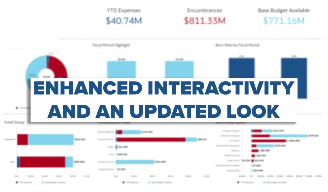
In an effort to showcase the power of Visualizer, UAIR has re-envisioned the Allocated Balance Available | Insights dashboard page, the Payroll Expenditure Listing | Insights dashboard page, and both the Income | Insights and Expenses | Insights dashboard pages utilizing this new tool. Explore these updated dashboards to discover enhanced interactivity and an updated look!

Discover the Allocated Balance Available Insights dashboard, which provides valuable and optimized budgetary data, helping users to understand, track, and manage their unit’s Allocated Budget. While the dashboard page provides information on base budgets, year-to-date expenses, encumbrances, and burn rates all by fiscal year breakdowns, it also allows users to engage with this data in new, high-level ways.

Explore the Payroll Expenditure Listing Insights dashboard and find a new and improved comprehensive view of your unit’s personnel expenditures with salary expense transfer (SET) information. While this dashboard page provides detailed data breakdowns of spending attributes, it also now offers a more interactive visualization of university expenditure data available at your fingertips.

Tour the Income Insights dashboard and explore the Expenses Insights dashboard to find extensive, in-depth views of your unit’s income and spending patterns. The Income Insights dashboard offers data on unit income broken down by funding source, consolidation levels, and AICPA descriptions with associated trends. The Expenses Insights dashboard provides the same level of data from the unit’s spending perspective. These dashboards are now optimized to provide new insights through clear and concise visualizations to further empower financial decision making at the university.
You can unlock new levels of interactivity with these updated reports is to right click on the visualizations. Right clicking on the graphs will allow you to filter data, export the analyses, and print your reports for sharing and distribution. With these releases, UAIR is demonstrating how Visualizer can offer new ways to interact with university data. Now it’s your turn to start leveraging the features that Visualizer has to offer.
Explore Visualizer for Yourself
You can access Visualizer from the Global Header at any time by clicking the Visualizer button.
Combining your own data with the breadth of institutional data from UAccess Analytics is one of the key features of Visualizer.
As you explore the new Visualizer tool, you will find that the main benefits are:
The ability to upload and integrate your own data.
It enhances visualization options.

Not only does Visualizer allow you to use additional graphs, charts, and maps to visualize institutional data, it also allows you to import custom datasets alongside what’s available in UAccess Analytics. UAIR’s UAccess Analytics Training Curriculum, available in EDGE Learning, has been updated and refined to offer a guided walkthrough of the Visualizer tool available to provisioned users.
If you are looking for additional support as you explore Visualizer, please do not hesitate to reach out to the UAIR team via the UAIR Support Hub, emailing us, or scheduling an Office Hour with one of our Data Analysts.
